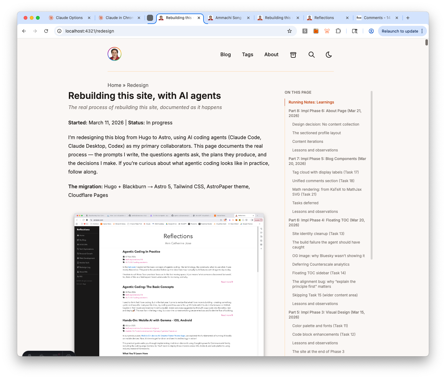
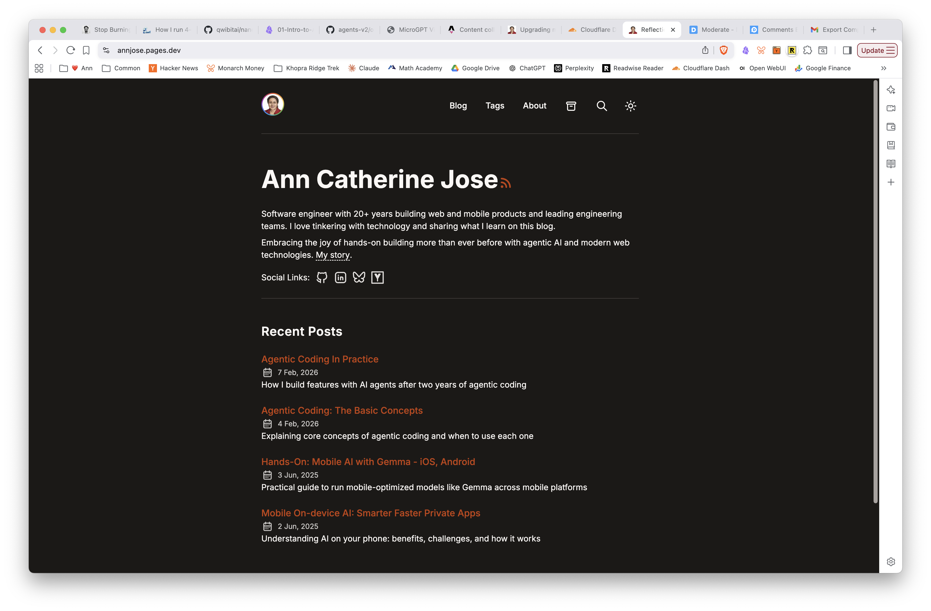
Started: March 11, 2026 | Status: In progress
I’m redesigning this blog from Hugo to Astro, using AI coding agents (Claude Code, Claude Desktop, Codex) as my primary collaborators. This page documents the real process — the prompts I write, the questions agents ask, the plans they produce, and the decisions I make. If you’re curious about what agentic coding looks like in practice, follow along.
The migration: Hugo + Blackburn → Astro 5, Tailwind CSS, AstroPaper theme, Cloudflare Pages
How to read this: Each part below is a chapter of the redesign. Newest entries are at the top.
Running Notes: Learnings
These are transferable techniques I’d use again on any project with an AI agent.
- Ask “what am I missing?” when reviewing any spec or plan — puts the agent in exploratory mode and surfaces gaps you’d never think to ask about
- Ask “what could go wrong?” and incorporate a mitigation plan before implementation starts
- For newer frameworks or critical integrations, paste in the relevant documentation URL and ask the agent to confirm the plan follows the framework’s recommendations (e.g. Astro Content Collections)
- Cross-evaluate competing specs by asking an agent to compare them — it surfaces risks and tradeoffs you’d miss reading them yourself
- Keep spec and plan as separate documents — spec = decisions + rationale (the “why”), plan = ordered checklist (the “how”). Mixing them makes both harder to use
- Context-switching back into an agentic project takes real time. After a 4-day gap, getting back into the flow required re-reading the spec, plan, and recent commits. It’s faster than pure manual coding (the plan and transcripts serve as breadcrumbs), but the idea that you can pop in and out of agentic sessions at will is a myth — you still need to rebuild mental context, and the agent needs to be caught up too.
- Always run the production build, not just the dev server. Vite’s dev server resolves imports lazily — a deleted file that’s still referenced will work in dev but fail in the production Rollup build.
pnpm run buildcatches whatpnpm run devdoesn’t. - Ask the agent to explain the expected behavior before fixing a visual bug. When something looks off, don’t just say “fix it.” Ask the agent what the correct behavior should be and why. This forces it to reason about the design principle (e.g., “all content in a column should share one left edge”) rather than trial-and-error patching. Three rounds of misalignment fixes could have been one if the principle was established first.
- Question transitive dependencies. When a library requires importing CSS from a dependency’s
dist/folder (likekatex/dist/katex.min.css), ask if there’s an alternative that avoids the coupling. In this case,rehype-mathjax/svgrenders math as inline SVG — no CSS import needed, one fewer thing to break. - Check what’s already built before building. Five of the nine Phase 5 tasks turned out to be already implemented by AstroPaper. Spending 5 minutes verifying existing functionality saves hours of redundant work.
- Question the spec when it doesn’t fit the tool. The spec called for a content collection for standalone pages, but Astro’s own docs warn against it for small numbers of independent pages. Checking the framework’s recommendations against the spec caught unnecessary complexity before it was built.
- Tell the agent explicitly not to write code when you’re still planning. The model can be eager to start coding. Even if you start in plan mode and ask it to detail the steps, it may jump out of plan mode and start implementing. If you switch it back to plan mode in the same session, it sometimes doesn’t stick. The fix: explicitly say “answer the question without changing any code or content” before asking.
- Off-the-shelf templates are surprisingly extensible with agents. AstroPaper’s Shiki-based code blocks were extended into a callout system (accent-bordered content blocks for song lyrics, quotes, etc.) by adding a single transformer and CSS — the agent figured out the approach and the meta string workaround for Shiki’s language normalization.
- Reuse components across different page types. The
TableOfContentscomponent built for blog posts was reused on the redesign page with zero changes. The agent created a new layout (RedesignLayout.astro) that imports the same component, just with a different container width. Shared components compound in value. - Third-party integrations are easier than you think. Giscus (GitHub Discussions-based comments) was the feature I was most worried about when planning the migration. Turns out: enable Discussions, configure at giscus.app, paste the credentials into the component, fix the View Transitions issue — done in 20 minutes. The agent handled the View Transitions bug (dynamic script creation on
astro:page-load) without any hints. - When a fix doesn’t take effect, suspect the cache before the code. Astro’s
.astrocache caused warnings to persist after the underlying issue was fixed — multiple times. The fix is trivial (rm -rf .astro), but the symptom erodes trust in your build output and wastes debugging time. - Delete docs aggressively during migrations. Six Hugo-era documentation files were deleted because they were obvious, thin, or obsolete. The remaining docs have genuine reference value. Less documentation, better maintained.
- Multi-agent handoffs work when the plan is specific. A structured handoff prompt with exact tasks, file paths, and constraints let a second agent session execute cleanly with no re-exploration. The wave-1-plan document serves as a shared contract between agents.
Part 10: Phase 8 — Testing, Polish & Tooling Cleanup (Mar 30, 2026)
Goal: Complete Phase 8 — fix content edge cases, build a comprehensive content sample post, and replace all Hugo-era tooling with Astro equivalents.
This part spans two agent sessions: one with Codex (GPT-5.3) for content debugging and the sample post, and one with Claude Code (Opus) for the tooling cleanup. Between them, the migration’s support infrastructure — scripts, docs, CI — was fully cut over from Hugo to Astro.
Content sample post
Every template needs a stress test. I asked Codex to create a single post that exercises every content pattern the site supports: standard markdown (headings, lists, tables, blockquotes, checklists), code blocks (standard, diff, filename meta, Shiki notation markers, callouts), inline and display math, images from both @/assets and public/ paths, <details> disclosure, <figure>/<figcaption>, and embedded video.
The post lives at /blog/content-sample — a slug override from the file name content-demo-post.md, which also validates the mixed slug routing fix (see below).
Building this post surfaced three bugs:
<details>styling — a CSS rule intypography.csswas hiding<p>elements inside<details>even when expanded. One-line fix.- Duplicate content ID warning — Astro’s content loader was parsing a
slug:value inside a YAML code example in the post body as a real frontmatter slug, producing a phantom duplicate. Fix: use a clearly-fake example slug. - Stale
.astrocache — warnings persisted after fixes untilrm -rf .astrocleared the cache. This happened multiple times. Runningpnpm devandpnpm buildconcurrently also caused false failures.
Mixed slug routing
The migration spec required “folder slug by default, frontmatter slug override when present.” But the repo’s getPath.ts was concatenating folder path + frontmatter slug, producing doubled URLs like /blog/math-latex-test/test-math-latex/.
Codex patched getPath.ts to detect a frontmatter slug and use it as the sole URL segment. Unit tests cover both the default-folder and slug-override paths. The math-latex post was the test case: with slug: "test-math-latex", the route correctly became /blog/test-math-latex/.
Tooling cleanup (Tasks 34a-c)
With the content work done, the next session focused on cutting the remaining Hugo dependencies from the repo’s support infrastructure. Three tasks, each committed separately:
Task 34a — Local checks. Deleted scripts/check-content.sh (which required Hugo binary). Replaced it with a vitest test (scripts/check-taxonomy.test.ts) that scans all blog posts for tag taxonomy collisions — the one genuinely useful check from the old script. The rest (Hugo build, TOML frontmatter parsing, config.toml checks) was no longer relevant.
Task 34b — Operator docs. Rewrote README.md and AGENTS.md for Astro (pnpm commands, YAML frontmatter, Cloudflare Pages deploy). Updated content-style-guide.md and taxonomy-conventions.md. Deleted six Hugo-era docs that were either thin, obvious, or obsolete: runbook.md, deploy.md, repo-structure.md, maintenance-baseline.md, theme-overrides.md, image-guidelines.md. The principle: if the content is straightforward, delete it; if it has real value, consolidate into README or a dedicated reference.
Task 34c — CI workflow. Replaced the GitHub Actions workflow (content-check.yml) — removed Hugo setup, ripgrep install, and submodule checkout. The new workflow: pnpm + Node 22 setup → pnpm test → pnpm run build. Branch triggers updated from master to astro and main.
Also fixed three pre-existing TypeScript warnings in the migration scripts (unused variables in convert-disqus.ts and migrate-content.ts) — astro check now reports zero warnings.
Lessons and observations
Agents make different kinds of mistakes. Codex went through four file renames for the content sample post before landing on a name I liked. It also changed a real frontmatter slug when I asked it to change the example slug in the post body — a reading comprehension error I had to catch. These aren’t logic bugs; they’re misinterpretations of intent that require the human to stay engaged.
Cache bugs are the worst kind of debugging. The stale .astro cache issue wasted significant time across multiple rounds. The fix is simple (rm -rf .astro), but the symptom — warnings that persist after the code is correct — erodes trust in the build output. Lesson: when a fix doesn’t take effect, suspect the cache before suspecting the code.
Delete docs aggressively during migrations. Six documentation files were deleted because their content was either obvious (repo structure), thin (deploy = push to branch), or Hugo-specific (theme overrides, maintenance baseline). The remaining docs — content style guide and taxonomy conventions — have genuine reference value. Less documentation, better maintained.
Multi-agent handoffs work when the plan is specific. The Codex session ended with a structured handoff prompt that listed exact tasks, file paths, and constraints. The Claude Code session picked up cleanly and executed all three tasks without re-exploration. The wave-1-plan document served as the shared contract between agents.
Phase 8 progress: Content sample post live, Hugo tooling fully replaced, CI modernized, zero build warnings. Remaining: Playwright e2e tests, Lighthouse CI, link checker, and JSON-LD structured data fixes.
Part 9: Impl Phase 7: Custom Routes, Redirects & Comments (Mar 21, 2026)
Goal: Complete Phase 7 — migrate standalone pages (/ammachi, /redesign), create Cloudflare redirect rules, verify RSS feed, and configure Giscus comments.
Output Artifacts:
- Live site on Astro — ammachi page, redesign page with TOC, Giscus comments, redirects
- Updated Wave 1 Plan — Tasks 26-30 checked off
- Agent Session Transcript #10 — Implementation Phase 7
This was the longest session so far — four tasks, each with its own challenges. The ammachi page led to building a reusable callout system. The redesign page required multiple rounds of TOC layout tuning. And Giscus, the feature I was most worried about, turned out to be the easiest.
Custom route pages (Task 26)
The ammachi page is a standalone page with a song that’s special to me. I wanted the lyrics displayed in a visually distinct way — not as a code block, but as content with an accent border. The agent proposed extending Shiki’s code block system: use ```text callout as a meta string, detect it in a custom transformer, and style it with CSS.
This turned into a reusable callout system with two variants:
```text callout— accent left border, no box, body font (for inline quotes and lyrics)```text callout boxed— adds a subtle border and background (for boxed callouts)
The implementation required working around a Shiki quirk: unknown language names get normalized to “plaintext” before transformers run, so you can’t use options.lang to detect custom blocks. The meta string approach (this.options.meta?.__raw) works because it survives normalization.
The redesign page — TOC sidebar and layout tuning (Task 26b)
The redesign page is the longest page on the site (600+ lines, 30+ headings), so it needed a Table of Contents. Rather than building a new component, the agent reused TableOfContents.astro from the blog post layout, wrapping it in a new RedesignLayout.astro with a two-column flex layout.
The layout went through several rounds of tuning based on screenshots:
- Content felt squished → adjusted flex constraints
- TOC too narrow → tweaked max-width and font size
- Large gap between content and TOC → reduced container from
max-w-6xltomax-w-5xl - Mobile TOC missing → moved mobile rendering above
<main>so it appears at top - h2 headings indistinguishable from h3 → added
font-mediumto h2 TOC entries
One subtle bug: the scroll highlight script was toggling font-medium as part of the active state, which removed the bold from h2 entries when they became inactive. Fixed by only toggling color and border classes.
The Astro Read tool has a default limit of 2000 lines, but the redesign page exceeded this. The agent handled it by using offset and limit parameters to read in chunks — no need to split the file.
Redirect rules and RSS (Tasks 28-29)
Three Cloudflare Pages redirect rules in public/_redirects:
/post/*→/blog/:splat(Hugo used “post”, Astro uses “blog”)/topics/*→/tags/:splat(Hugo taxonomy name)/index.xml→/rss.xml(Hugo’s RSS path)
RSS feed at /rss.xml was already generated by AstroPaper — just verified it builds correctly.
Giscus comments (Task 30)
This was the task I was most worried about when I first planned the migration. Moving from Disqus to a new comment system felt like it would be complicated. It wasn’t.
The setup: enable GitHub Discussions on the repo, configure at giscus.app (pathname mapping, Announcements category), paste the credentials into GiscusComments.astro. The whole thing took about 20 minutes.
The one real issue was a View Transitions bug — Giscus loaded on the first page but disappeared when navigating to the next post via prev/next links. The root cause: Astro’s ClientRouter does client-side navigation, so the static <script> tag never re-executes. The fix: dynamically create the script element on every astro:page-load event. The agent identified the issue and implemented the fix without any hints.
Lessons and observations
Tell the agent not to code when you’re still planning. The model can be eager to start writing code. Even in plan mode, it sometimes jumps to implementation. The fix is explicit: “answer the question without changing any code or content.” This keeps the conversation in design mode until you’re ready to build.
Off-the-shelf templates are surprisingly extensible. The callout system extended AstroPaper’s Shiki code blocks into styled content blocks for lyrics and quotes — just one transformer file and some CSS. The agent figured out the meta string workaround for Shiki’s language normalization. You don’t need to fork the template to customize it.
Reuse components across page types. The TableOfContents component built for blog posts worked on the redesign page with zero changes. The agent created a new layout that imports the same component with a different container width. Shared components compound.
Third-party integrations are easier than expected. Giscus was my biggest migration worry. Reality: 20 minutes from zero to working comments with reactions, lazy loading, and dark mode support. The View Transitions fix was the only non-trivial part, and the agent handled it autonomously.
Phase 7 complete. Custom routes, redirects, RSS, and comments all working. On to Phase 8: Testing & Polish.
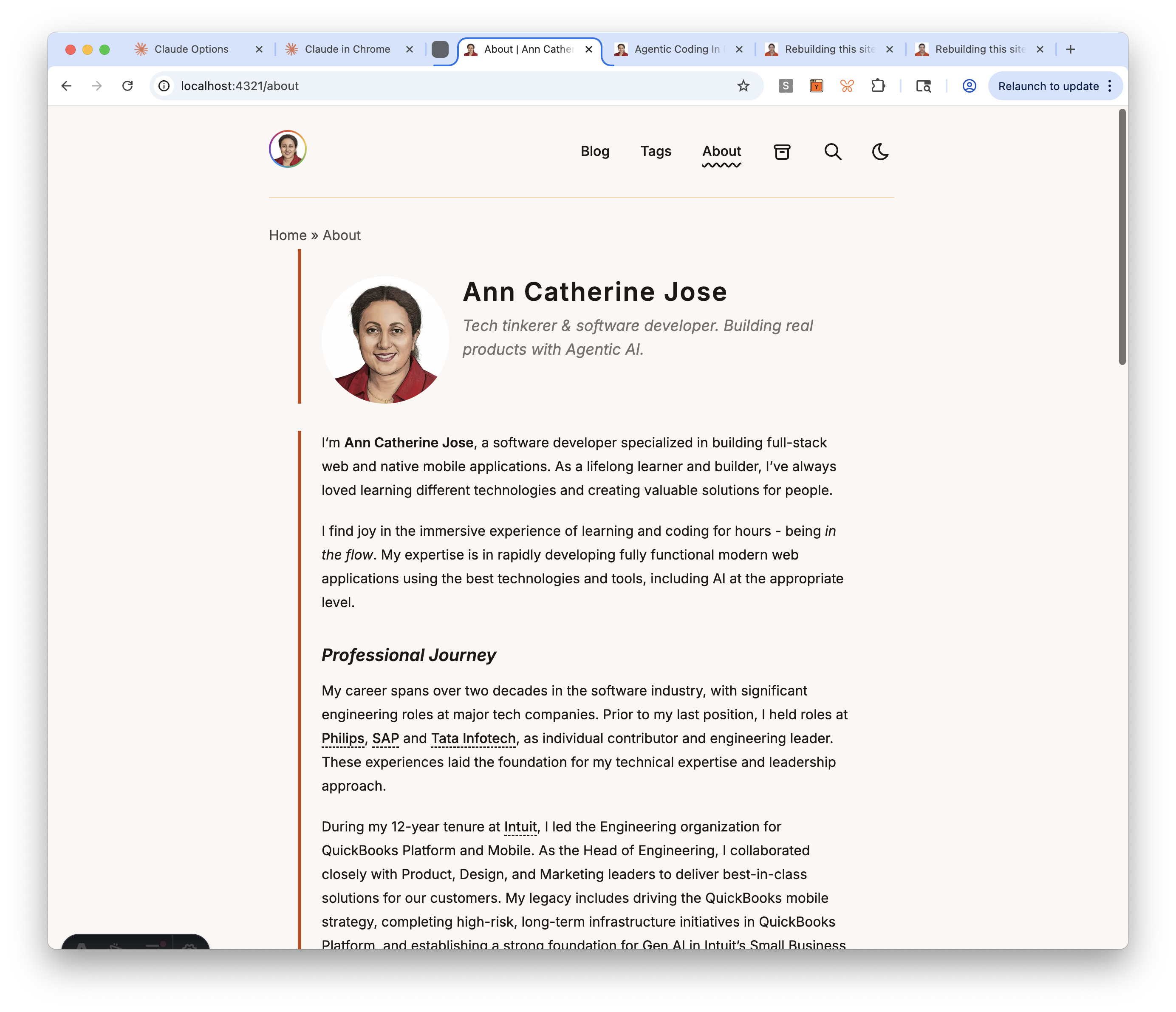
Part 8: Impl Phase 6: About Page (Mar 21, 2026)
Goal: Build the About page — replace the AstroPaper placeholder with a real bio in a sectioned profile layout.
Output Artifacts:
- Live site on Astro — About page live with sectioned profile
- Updated Wave 1 Plan — Task 25 checked off
- Agent Session Transcript #9 — Implementation Phase 6
This was a focused session — one task, but with significant content iteration. The technical implementation was straightforward; the real work was getting the content right.
Design decision: No content collection
The spec originally called for a pages content collection loaded via getEntry('pages', 'about'). But when I thought about it, a collection doesn’t make sense here — each standalone page (/about, /ammachi, /epsilla) has completely different frontmatter and structure. Astro’s own docs say collections are overkill for a small number of independent pages.
Instead, we kept the existing pattern: src/pages/about.md (markdown with structured frontmatter) → enhanced AboutLayout.astro (reads frontmatter, renders sections). Simple, no collection boilerplate, and each future page can have its own layout.
The sectioned profile layout
The layout renders five sections, each with a burnt orange left accent border (border-l-4 border-accent):
- Hero — profile photo (Astro
Image, rounded) + name + tagline, side-by-side on desktop, stacked on mobile - Bio — the markdown body rendered via
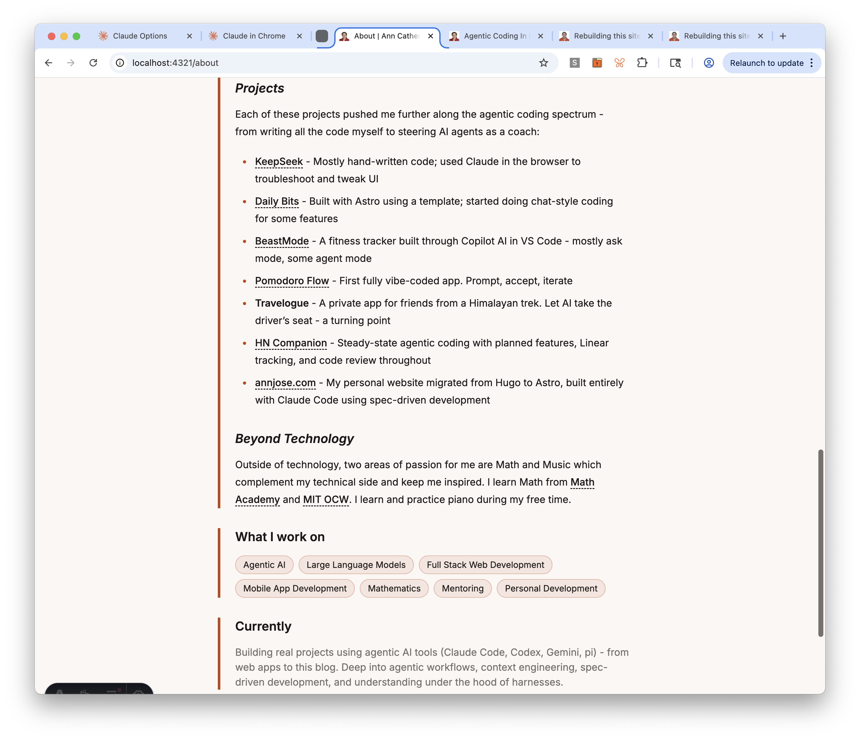
<slot />withapp-prosestyling - “What I work on” — interest tags from frontmatter, rendered as styled pills
- “Currently” — a blurb about what I’m focused on right now
- Connect — reuses the existing
Socials.astrocomponent
The social links section was a zero-effort win — the Socials.astro component and SOCIALS constant already had my GitHub, LinkedIn, Bluesky, and Hacker News profiles configured.
Content iterations
The bio content went through several rounds of refinement during the session:
- Tagline: Changed from the spec’s “Engineer, writer, and perpetual learner” to “Tech tinkerer & software developer. Building real products with Agentic AI.” — more specific, more me.
- Currently: Upgraded from a generic “exploring the intersection of AI tools…” to listing specific tools (Claude Code, Codex, Gemini, pi) and practices (context engineering, spec-driven development, understanding harnesses).
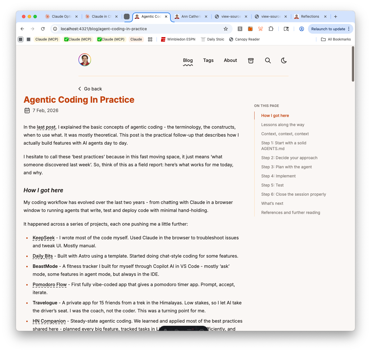
- Projects section: Added a new section showing 7 projects in order of agentic coding progression — from KeepSeek (mostly hand-written) to this blog (fully agentic with spec-driven development). Content adapted from my blog post on agentic coding in practice.
- Philosophy of Life: Removed — two blockquotes followed by a sentence felt generic. The rest of the bio already shows values through actions.
Lessons and observations
Question the spec when it doesn’t fit the tool. The spec called for a content collection, which is a reasonable default for frameworks that provide them. But Astro’s own docs warn against using collections for a small number of independent pages. Asking “why do we need this?” saved unnecessary infrastructure and kept the implementation simple.
Content is the hard part. The layout took 15 minutes to build and worked on the first try. The bio content took the rest of the session — iterating on tagline, rewriting the “currently” section, adding a projects list, removing the philosophy section. The agent can build the frame, but filling it with authentic content requires the human.
Phase 6 complete. About page live with sectioned profile layout. On to Phase 7.
Part 7: Impl Phase 5: Blog Components (Mar 20, 2026)
Goal: Complete Phase 5 — tag cloud, comments, math rendering, and verify that code blocks, search, and images are already working.
Output Artifacts:
- Live site on Astro — tag cloud, archived comments, math rendering live
- Updated Wave 1 Plan — Tasks 16-24 checked off
- Agent Session Transcript #8 — Implementation Phase 5
Phase 5 covered nine tasks, but five of them turned out to be already implemented by AstroPaper — prev/next navigation, code block enhancements, search, and image optimization were all working out of the box. The real work was in three areas: tag cloud with display labels, a unified comments section, and math rendering.
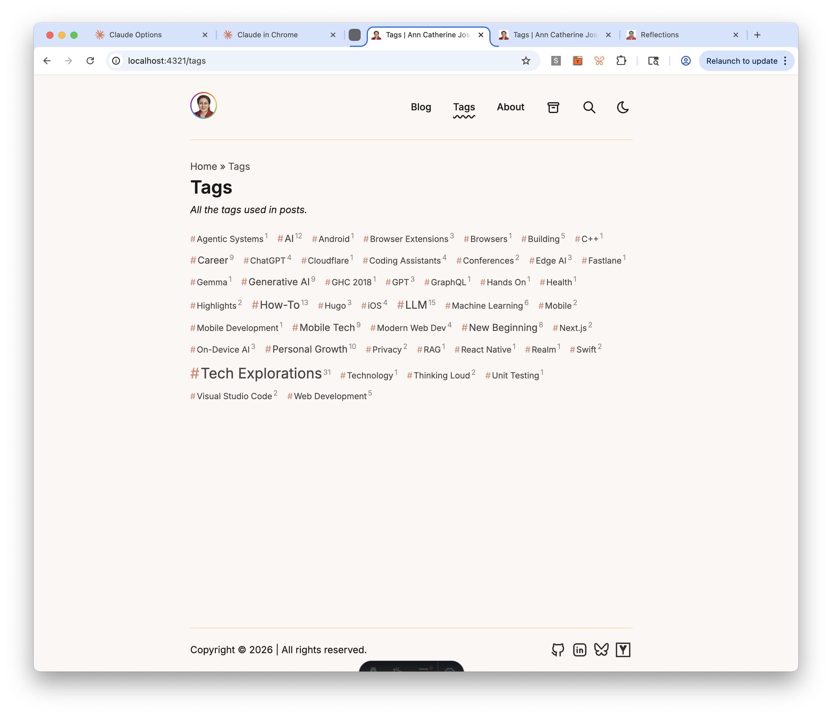
Tag cloud with display labels (Task 17)
The tag cloud needed to solve two problems: visual weight (popular tags should look bigger) and display labels (the slug ai should display as “AI”, not “Ai”). The implementation uses TDD — 41 tests for getTagLabel() covering acronyms, compound tags, and auto-title-case fallback.
The tag cloud component sorts alphabetically, uses 5 font-size tiers based on post count, prefixes each tag with # in accent color, and shows post count as a superscript.
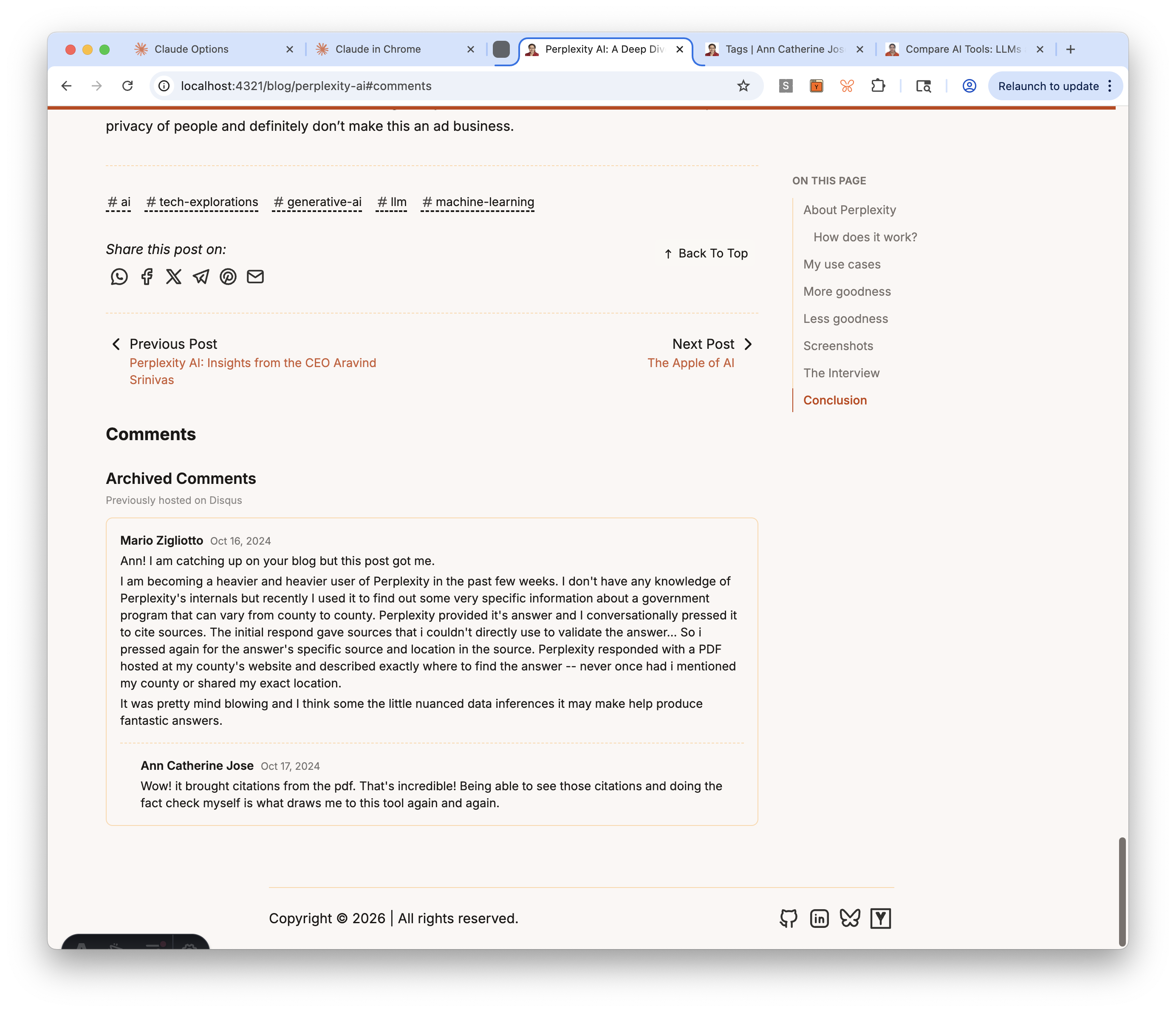
Unified comments section (Task 18)
The comments section combines two components: ArchivedComments.astro (static HTML exported from Disqus, rendered only for the 9 posts that had comments) and GiscusComments.astro (placeholder for new GitHub Discussions-based comments, configured in Task 30).
The structure went through two user corrections. First, comments were placed after the prev/next navigation — moved them before, since comments are part of the post content while nav is for leaving. Second, clicking the #comments anchor was skipping past the archived comments because they were in a separate section — restructured into a unified section with archived comments as an h3 subsection.
A comment icon (speech bubble) in the post header links to #comments, so readers don’t have to scroll to the bottom to find the comments section.
Math rendering: from KaTeX to MathJax SVG (Task 21)
This task had the most interesting debugging journey. The initial implementation used rehype-katex, which required importing CSS from a transitive dependency (katex/dist/katex.min.css). When I asked about alternatives, the agent swapped to rehype-mathjax/svg — which renders math as inline SVG with no CSS dependency at all.
But after the swap, inline math expressions like <svg> elements to display: block, so even though the parent mjx-container had display: inline, the SVG inside it forced a line break. A one-line CSS fix resolved it:
mjx-container:not([display]) > svg { display: inline }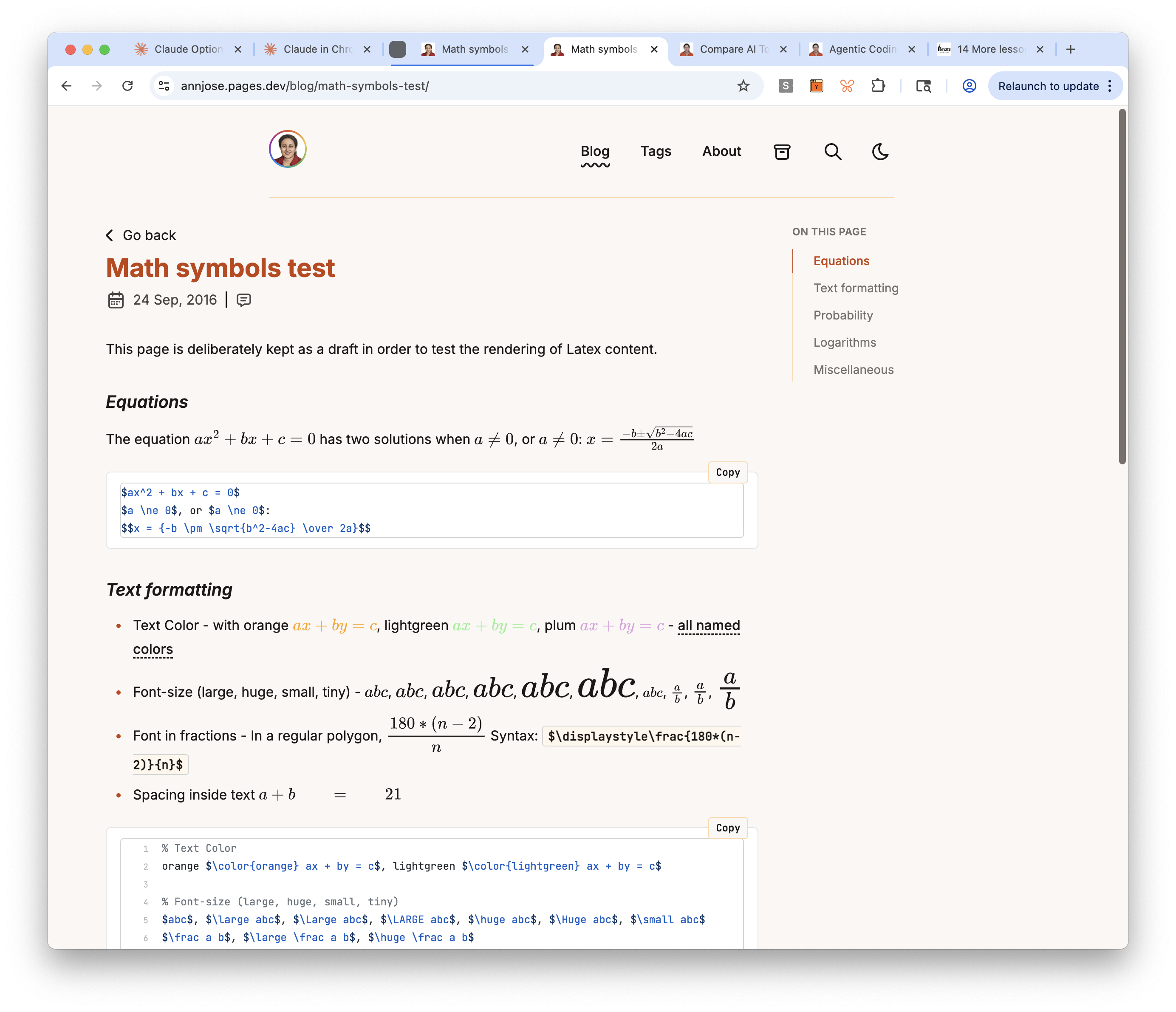
Tasks deferred
- Task 23 (image grid): No posts currently use multi-column image grids — deferred to Wave 2.
- Task 24 (reading time): Moved to Phase 8 as Task 30b, after Giscus setup.
Lessons and observations
Check what’s already built. Five of nine Phase 5 tasks were already implemented by AstroPaper. The agent verified each one by inspecting the codebase and dev server, marked them complete, and moved on. No wasted effort building something that already exists.
Question transitive dependencies. The KaTeX approach required importing CSS from katex/dist/katex.min.css — a file inside a transitive dependency. When Tailwind’s reset conflicted with KaTeX’s styles, it needed a !important override. Swapping to rehype-mathjax/svg eliminated both the CSS import and the override. Fewer dependencies = fewer things that can break.
Browser defaults matter. The inline math bug wasn’t caused by any CSS we wrote — it was the browser’s default display: block on <svg> elements. This is the kind of issue that’s invisible in DevTools (the parent shows display: inline correctly) but obvious visually. Understanding what the browser does by default, not just what your CSS does, is essential for debugging layout issues.
Phase 5 complete. Tag cloud, comments, math rendering all working. On to Phase 6: About Page.
Part 6: Impl Phase 4: Floating TOC (Mar 20, 2026)
Goal: Complete Phase 4 (Core Layouts) — site identity, OG image, and floating Table of Contents sidebar on blog posts.
Output Artifacts:
- Live site on Astro — site identity updated, floating TOC sidebar on blog posts
- Updated Wave 1 Plan — Tasks 13-14 checked off, Task 15 skipped
- Agent Session Transcript #6 — Implementation Phase 4 Part 1
- Agent Session Transcript #7 — Implementation Phase 4 Part 2
This session started after a 4-day break from the migration. Phase 4 is about Core Layouts, and Task 13 was the entry point — cleaning up all the template defaults that were still in the <head> tag: the title “Reflections,” AstroPaper’s default OG image, a stale description, and an empty theme-color meta tag.
Site identity cleanup (Task 13)
The first step was a comprehensive audit. I had the agent inspect the live dev server through Chrome — extracting every meta tag, JSON-LD block, and link element from the <head>. This surfaced everything that needed changing in one pass rather than discovering issues one by one.
The fixes: title changed from “Reflections” to “Ann Catherine Jose” everywhere (config, OG tags, Twitter cards, JSON-LD), description updated, OG image replaced with a custom 1200×634 branded card, theme-color set to the warm palette’s background color, and a missing og:type tag added.
The build failure the agent should have caught
After replacing the OG image, the Cloudflare deploy failed — about.md still referenced the deleted astropaper-og.jpg. The dev server didn’t catch it because Vite resolves imports lazily. The production Rollup build does a strict resolve and fails on missing files.
The agent should have run pnpm run build before declaring the commit ready. It didn’t. I caught it from the Cloudflare deploy logs. A good reminder that the dev server and the production build are different beasts — always verify with the build.
OG image: why Bluesky wasn’t showing it
After deploying the fix, I tried pasting the site URL into a Bluesky post. Title and description appeared, but no image. The issue: SITE.website was set to https://annjose.com/, so the og:image URL resolved to annjose.com/og-default.jpg — but the Hugo site at that domain doesn’t have that file. Bluesky’s crawler fetched it, got a 404, and showed no preview.
The fix was temporary: point SITE.website to annjose.pages.dev for testing, confirm the image renders, and plan to revert during the pre-cutover phase (Task 40) when the domain points to the Astro site.
I also researched OG image best practices — a 1200×630 branded card (photo + name + tagline) is the standard for personal sites. A bare profile photo would look awkward in the rectangular preview space. And og:logo, which one validator flagged as missing, isn’t in the official Open Graph spec — safe to ignore.
Deferring Counterscale analytics
The original plan had Counterscale analytics in Task 13, but I decided to defer it to Task 40 (pre-cutover). Adding the tracking script now would log dev and preview traffic against the production data-site-id, polluting real analytics data. Better to add it right before the DNS cutover.
Floating TOC sidebar (Task 14)
The second half of this session added a floating Table of Contents sidebar to blog posts. The TOC appears as a sticky sidebar on desktop (showing “ON THIS PAGE” with all h2/h3 headings) and as a collapsible dropdown on mobile. An IntersectionObserver highlights the current section as you scroll — the active heading gets the burnt orange accent color with a left border indicator.
The implementation replaced AstroPaper’s built-in remark-toc plugin (which generated an inline, collapsed TOC within the markdown body) with a proper Astro component that receives headings from render(). Posts with fewer than 3 headings show no TOC at all.
The layout restructure was where things got interesting. The post page needed a two-column flex layout at desktop widths (max-w-6xl container with article + sidebar), while keeping a single narrow column (max-w-3xl) for short posts without a TOC. This created an alignment problem that took three rounds to get right.
The alignment bug: why “explain the principle first” matters
The initial implementation split the page into two containers — the title/date in a narrow centered container, and the article+TOC in a wider flex container. The result: the article text started at a different left edge than the title. It looked jarring.
I flagged it. The agent moved the title into the flex container. Fixed — but then “Go back” was still in its own container, offset from everything else.
I flagged that too. The agent moved it. But now “Go back” had double padding — the outer container’s px-4 plus BackButton’s own app-layout px-4.
At this point, instead of saying “fix it again,” I asked the agent to explain what the correct behavior should be and why before making any more changes. The answer was clear: all elements in the content column — “Go back,” title, date, TOC dropdown, and body text — should share one left edge. That’s basic visual hierarchy. Once the principle was stated, the fix was obvious: remove the redundant layout wrapper from BackButton.
Three rounds of fixes that could have been one, if the design principle had been established first. This is now my default approach: when something visual looks off, ask the agent to articulate the expected behavior before touching the code.
Skipping Task 15 (wider content area)
The plan called for widening the content area from max-w-3xl to max-w-4xl. I asked the agent whether this was worth doing. The recommendation was to skip it — 768px is near optimal line length for readability, posts with a TOC sidebar already use the wider container, and widening content would require widening every other page for consistency. I agreed and removed Task 15 from the plan.
Lessons and observations
Resuming after a break is harder than expected. Four days away from the project meant re-reading the spec, plan, last session’s transcript, and recent git history before I could start. The plan and transcripts made this faster than it would be without them — they’re like breadcrumbs back into the project. But it still took real time. The popular notion that you can seamlessly pop in and out of agentic coding sessions overstates how easy it is.
Audit before you edit. Having the agent inspect the live <head> through Chrome before making any changes was the right move. It surfaced the missing og:type, the empty theme-color, and the stale title all at once — rather than fixing one thing, deploying, finding another, and iterating.
Social media previews need the right domain. OG tags are only useful if the URL in og:image actually resolves. During development, when your domain points elsewhere, previews will silently fail. This is expected — but it’s worth testing once with the correct URL to confirm the image works, then reverting.
Ask “what should this look like?” before “fix this.” When the agent produces something visually wrong, the instinct is to say “that’s misaligned, fix it.” But without establishing the design principle first, you get iterative patches that each fix one symptom while introducing another. Asking the agent to articulate the expected behavior forces it to reason about the underlying rule — and the fix that follows is usually correct on the first try.
Question every task in the plan. Task 15 (wider content area) seemed reasonable in the abstract but would have made the site harder to read and created consistency problems across pages. The plan is a starting point, not a mandate. Asking “is this actually worth doing?” before each task prevents unnecessary work.
Part 5: Impl Phase 3: Visual Design (Mar 15, 2026)
Goal: Apply the Warm & Earthy color palette and typography from the spec, then refine code block styling for readability.
Output Artifacts:
- Live site on Astro — warm palette and new fonts live
- Updated Wave 1 Plan — Phase 3 tasks checked off
- Agent Session Transcript #5 — Implementation Phase 3
Phase 3 was about making the site feel right — replacing AstroPaper’s default blue/orange scheme with a warm, earthy palette and swapping fonts to Inter + JetBrains Mono. Two tasks, but they touched almost every visual surface on the site.
Color palette and fonts (Task 11)
The spec called for a “Warm & Earthy” palette — warm whites (#faf7f5), warm blacks (#1c1917), burnt orange accent (#c2410c), and muted stone tones. Claude updated the CSS custom properties in global.css for both light and dark modes, added new --tag-bg and --tag-border variables for tag pills and table styling, and mapped everything through Tailwind’s @theme inline block.
For fonts, Astro’s experimental fonts API made the swap clean — replace the single Google Sans Code entry in astro.config.ts with Inter (body text) and JetBrains Mono (code), add <Font> components in Layout.astro, and wire the CSS variables. No Google Fonts link tags or Tailwind font config needed.
The bulk of this task was iterative visual refinement. I browsed the site in the preview and flagged issues one by one:
- Inline code looked muddy — the
bg-muted/75background was a gray-brown (#78716cat 75% opacity) that clashed with the warm palette. Switched tobg-tag-bgwith a subtle border for a clean pill-like appearance. - Copy button too dark — the code block copy button used
bg-mutedwhich was almost the same darkness as the code block itself. Changed tobg-background/80withbackdrop-blur-smfor a translucent floating effect. - Code block borders too warm — the warm orange
--border(#fed7aa) on code blocks looked off next to syntax highlighting colors. Switched to neutral grays (border-neutral-200light,border-neutral-700dark). - Inline code had double borders — after fixing code blocks, inline code pills still had the orange
border-tag-border. Switched toborder-neutral-300/dark:border-neutral-600to match.
Each fix was small, but finding the right combination required looking at the site in context — screenshots of real posts with real code and tables.
Code block enhancements (Task 12)
Two changes: enable line wrapping instead of horizontal scrollbars (wrap: true in Shiki config), and add line numbers on longer code blocks. The line numbers use a CSS counter with a :has(.line:nth-child(4)) selector — blocks with fewer than 4 lines stay clean, longer blocks get subtle gray numbers that are user-select: none so they don’t interfere with copy-paste.
Tables also got a refresh with bg-tag-bg header rows and alternating bg-tag-bg/50 even rows — small touches that improve readability.
Lessons and observations
Visual design is inherently iterative. Unlike content migration (which is either correct or broken), visual styling is a matter of judgment. The palette looked right in isolation, but real posts with code blocks, tables, and inline code exposed mismatches that only became visible in context. Five rounds of adjustments to get the code styling right — and each round required browsing the actual site, not just reading CSS.
The agent can apply a palette, but the human spots what’s “off.” Claude implemented every color change correctly on the first try. But I was the one who noticed the muddy inline code background, the too-dark copy button, and the warm-orange borders clashing with syntax highlighting. The feedback loop was: I browse, I flag, Claude fixes. Neither of us could have done this well alone.
CSS custom properties + Tailwind @theme inline is a good architecture. Having all colors defined as CSS variables in one place (global.css), with Tailwind consuming them through @theme inline, meant every change propagated everywhere instantly. No hunting for hardcoded color values across components.
The site at the end of Phase 3
Phase 3 complete. Warm & Earthy palette applied, Inter + JetBrains Mono fonts loaded, code blocks styled with line wrapping and conditional line numbers. On to Phase 4.
Part 4: Impl Phase 2: Content Migration (Mar 14, 2026)
Goal: Migrate all 58 blog posts from Hugo to Astro, validate everything, and export Disqus comments.
Output Artifacts:
- Live site on Astro — deployed on Cloudflare Pages
- Updated Wave 1 Plan — Phase 2 tasks checked off
- Agent Session Transcript #4 — Implementation Phase 2
Phase 2 was the heaviest part of the migration — converting 58 blog posts from Hugo’s TOML frontmatter and shortcodes to Astro’s YAML frontmatter and standard markdown. This is where the migration script did the heavy lifting, and where most of the bugs surfaced.
The migration script (Task 8)
Claude wrote the migration script using TDD — 23 tests first, then the implementation. The script handles TOML→YAML frontmatter conversion, five types of Hugo shortcodes (pure_table, fluid_imgs, video, figure, highlight), and copies page bundles with their colocated images. I was impressed by the test coverage — it caught edge cases I wouldn’t have thought to test, like posts with no tags, dates with timezone offsets, and nested directories inside page bundles.
Running the migration and fixing what broke (Task 9)
Running the migration script was the moment of truth — and predictably, several things broke. This is where the iterative debugging with Claude was most valuable. Each fix led to a new discovery:
-
Page bundle subdirectories — one post (
cloudflare-autorag-step-by-step) had araw-images/subdirectory inside its page bundle. The copy function tried tocopyFileSynca directory. Claude added a recursive copy helper. -
Missing shortcode types — four posts had
figureandhighlightshortcodes that weren’t handled. Claude added converters for both. -
Images inside HTML blocks — this was the most interesting bug. Hugo’s
fluid_imgsshortcode was being converted to markdown images wrapped in<div class="image-grid">. But markdown inside HTML block elements is not parsed — it’s treated as raw text. The images simply didn’t render. The fix was to drop the<div>wrapper entirely and output plain markdown images. The trade-off: we lose the multi-column grid layout for now (added to Wave 2 backlog). -
Images in two locations — I had to correct Claude that images weren’t only in
static/img/— some were incontent/img/too. A good reminder that the human’s knowledge of the codebase matters. -
Double-slug URLs — page bundle posts were generating URLs like
/blog/slug/slugbecause AstroPaper’sgetPathutility was duplicating the directory name as a path segment. Claude traced through the path generation logic and added a filter for duplicate segments. -
YAML date quoting — Astro’s
z.date()schema expects unquoted YAML dates, butjs-yaml’sforceQuotes: truewas quoting them as strings. Fixed by passingnew Date()objects instead of strings to the YAML serializer.
Pulling Task 27 forward: /posts/ → /blog/
I had originally planned the URL rename for later, but realized it made no sense to deploy with /posts/ URLs and then rename later — that would create unnecessary redirects. So we pulled Task 27 into this session. Claude renamed the page directories, updated getPath.ts, and changed the nav/breadcrumb labels. I chose “Blog” for the nav link and “Reflections” for the page title — a nod to the original blog name.
Disqus comment export (Task 10)
The final task was converting the Disqus XML export to static HTML fragments. The XML had 193 threads (many duplicates from old domain changes and Google Translate proxies) and 34 comments. Claude wrote the conversion script with 15 tests, filtered out 2 deleted and 8 spam comments, and generated 9 HTML files with 24 valid comments. Threaded replies are preserved with recursive rendering.
The comments aren’t displayed on the site yet — that requires the DisqusComments component in Phase 5. For now they sit as static HTML ready to be plugged in.
The site at the end of Implementation Phase 2
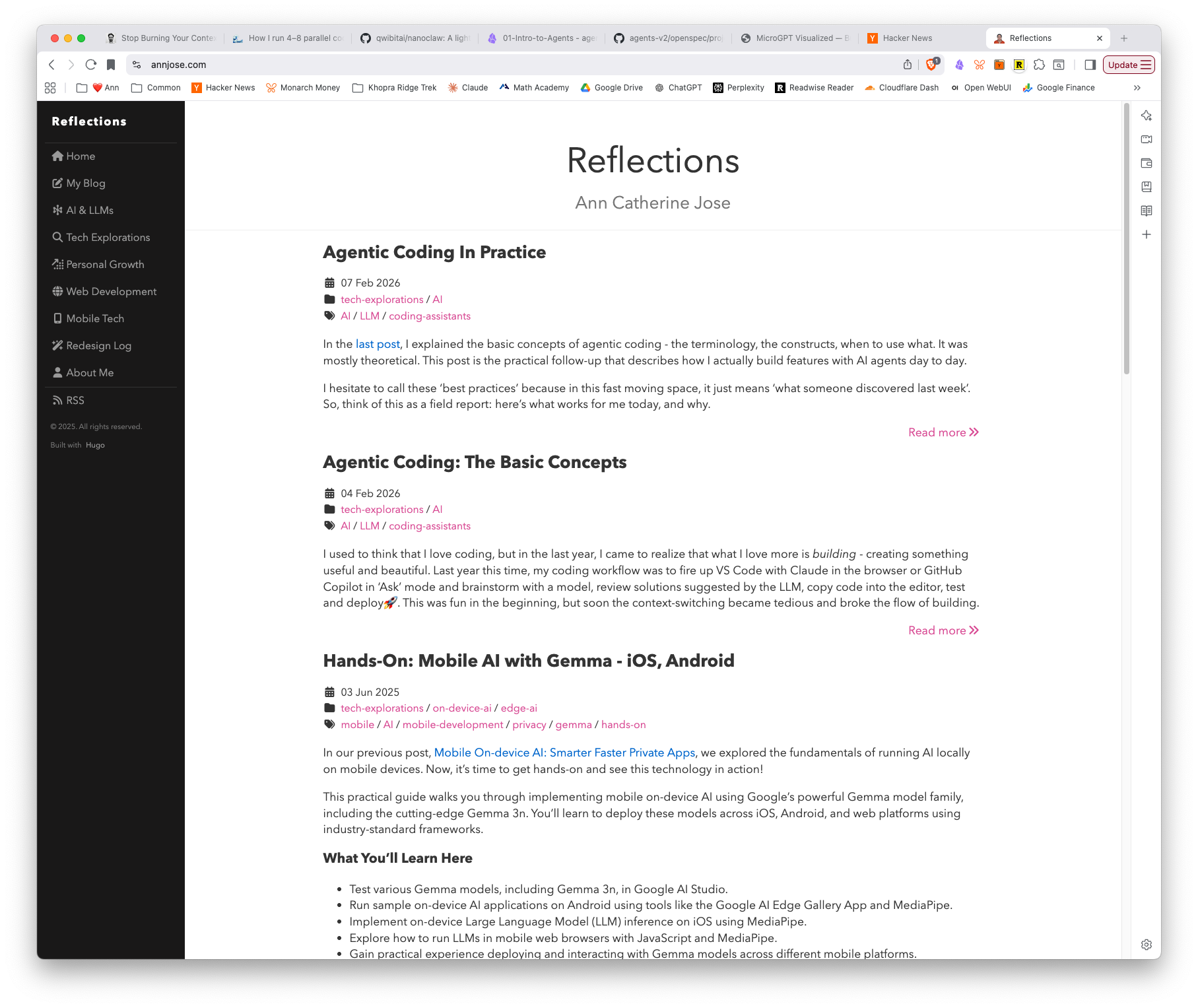
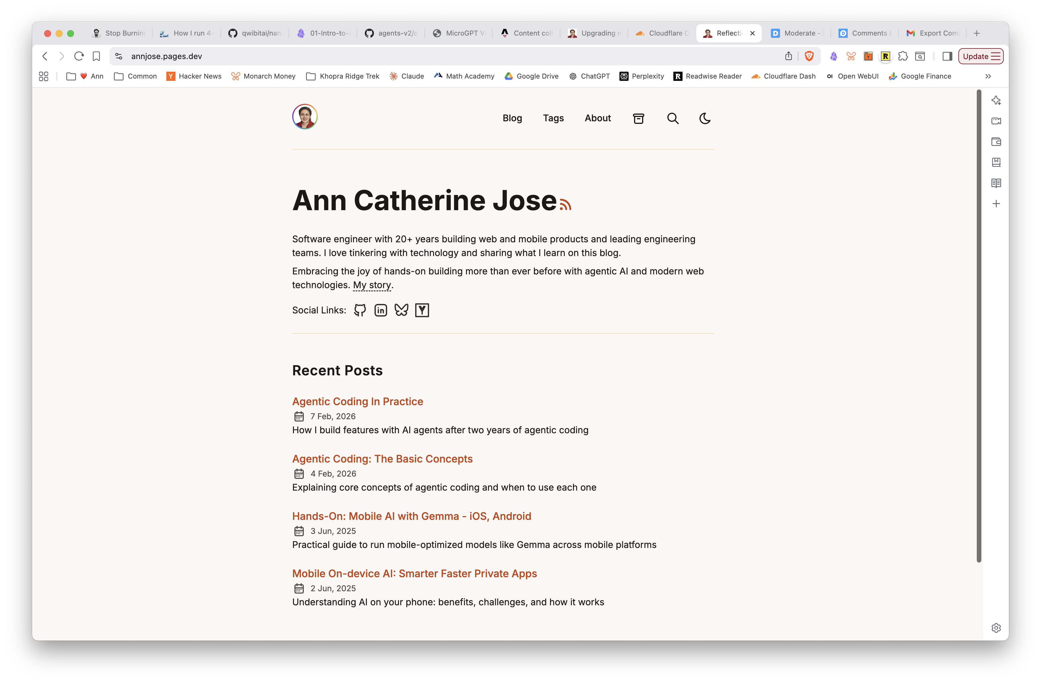
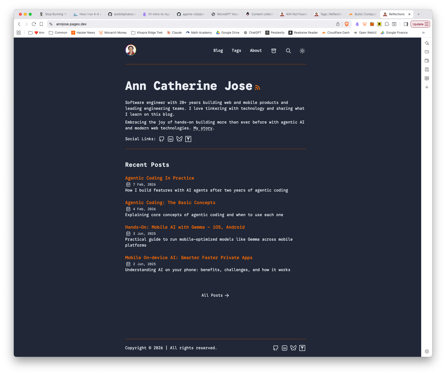
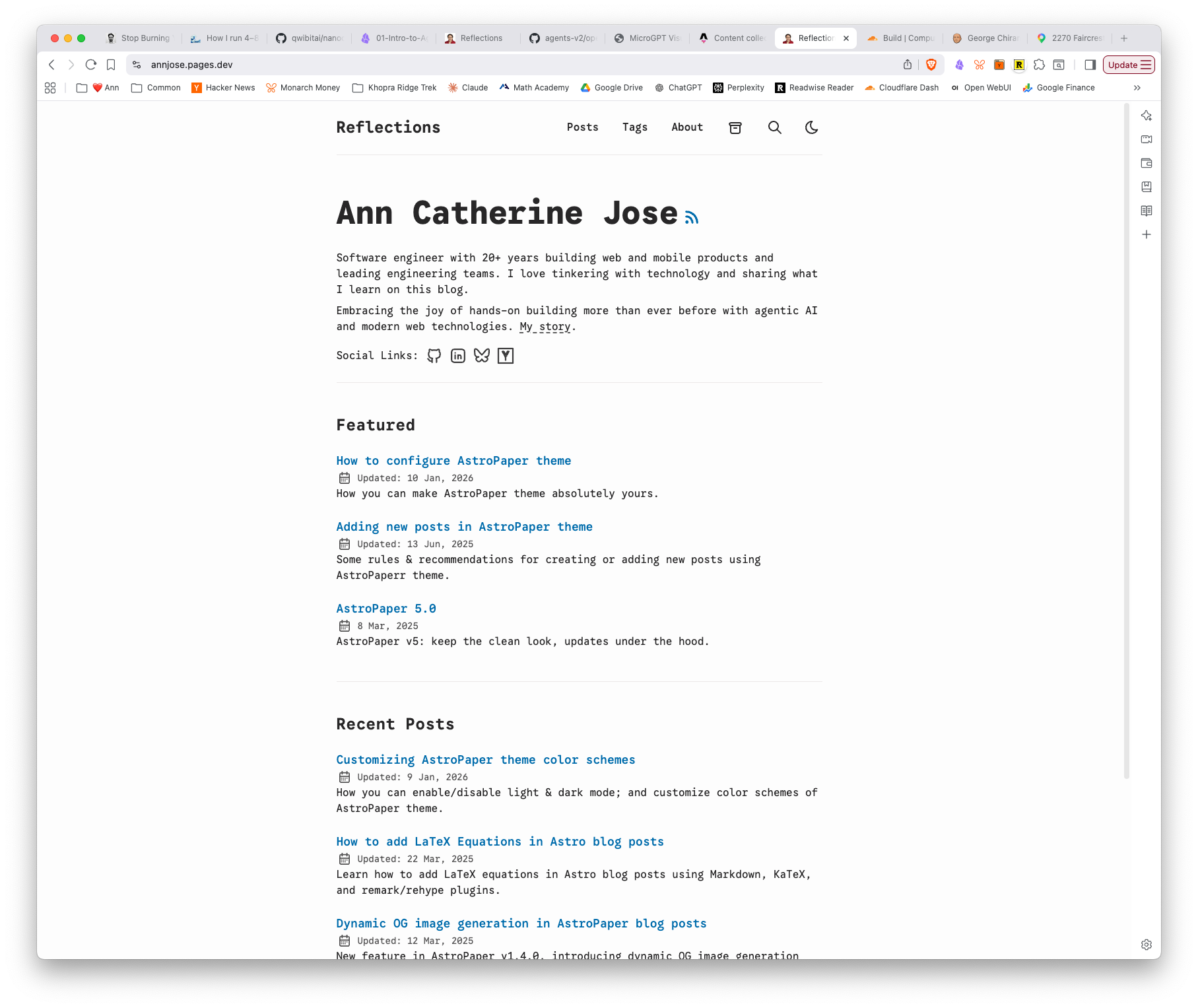
Here’s the new Astro site with all 58 posts migrated, avatar ring, and the “Reflections” page title — in both light and dark mode:
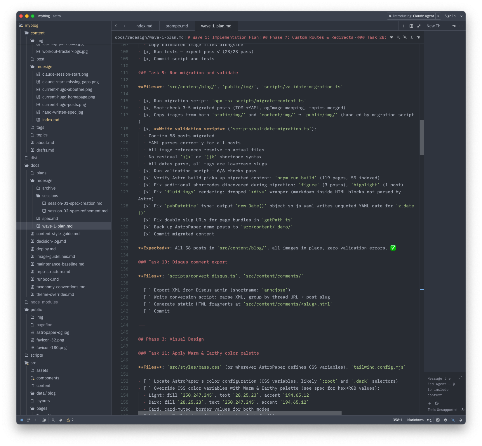
And here’s Claude Code’s wave-1-plan showing the task progress — Phase 2 fully checked off:
Lessons and observations
One bug leads to five. The migration script worked on the first run, but validation exposed a chain of issues that each required understanding a different part of the system — Astro’s markdown processing, AstroPaper’s URL generation, Hugo’s image storage, YAML serialization quirks. Each fix was small, but finding the root cause required reading code carefully.
The agent is good at fixing what it can see, but needs the human for what it can’t. Claude found and fixed the HTML-block image rendering issue, the double-slug bug, and the date quoting problem entirely on its own. But it needed me to point out that images lived in content/img/ (not just static/img/), and that the URL rename should happen now rather than later. The human provides context that isn’t in the code.
TDD paid off. The 23 migration tests and 15 Disqus tests made it safe to iterate quickly. When I asked for changes (drop the <div> wrapper, change the URL base path), Claude could make the change and immediately verify nothing else broke.
Many a times, I would commit the code changes, push, but forget to check the build status on Cloudflare. And I would keep pushing new commits while the build may have failed 3 commits ago. I wish there was a better way to know if the Cloudflare build failed or not.
Phase 2 complete. All 58 posts migrated, validated, and live at /blog/<slug>. Disqus comments exported. On to visual design.
Part 3: Implementation Phase 1: Project Bootstrap — Mar 13, 2026
Goal: Go from empty branch to a fully deployed Astro site on Cloudflare Pages, with custom branding and favicon.
Output Artifacts:
- Live site on Astro — vanilla AstroPaper deployed on Cloudflare Pages
- Updated Wave 1 Plan — Phase 1 tasks checked off
- Agent Session Transcript #3 — Implementation Phase 1
Phase 1 was about getting the foundation in place — scaffolding the Astro project, configuring it with my branding, and deploying to Cloudflare Pages so I could see real results from day one. Six tasks, spread across two days.
Repo rename and branch setup (Tasks 1-2)
The first decision was timing: rename the GitHub repo from myblog to annjose.com before connecting Cloudflare Pages, not after. Getting this out of the way early avoided renaming headaches later. GitHub’s auto-redirect meant the old URL kept working — no broken links.
Claude cleaned up the Hugo files (themes, config, submodules) while preserving content and docs, then scaffolded AstroPaper into the repo. One early question: npm or pnpm? AstroPaper ships with a pnpm-lock.yaml, and pnpm is stricter about dependency resolution. I decided to switch — Claude swapped the lock file and updated the spec with a decision entry explaining the rationale.
Here’s what the site looked like right after scaffolding — vanilla AstroPaper with its default content:
Site metadata and syntax highlighting (Task 3)
Configuring src/config.ts with site title, author info, and social links was straightforward. The more interesting part was syntax highlighting — Claude set up dual themes (night-owl for dark mode, github-light for light) with line numbers enabled. This is one of those things that’s easy to configure but tedious to figure out from scratch.
There was a moment of confusion here: when I said “the plan,” I meant the wave-1-plan.md file, but Claude interpreted it as its own internal execution plan. A small communication mismatch, but a reminder that shared vocabulary matters when working with an agent.
The favicon saga (Task 5)
This was the most iterative part of the session. I started with my existing Hugo favicon (a simple .ico), but then decided to use a pencil sketch avatar instead. The first attempt used sips (macOS built-in) to resize a non-square image into a 32×32 favicon — which stretched it horizontally. After a couple of rounds:
- First attempt — black-and-white sketch, rectangular (1408×1718). Forced to square → stretched.
- Second attempt — I provided a square crop. Cropped the head at the top.
- Third attempt — I created a proper 1600×1600 square version. Worked, but I wanted color.
- Final version — colorized sketch, 1800×1800 square. Generated clean 32px and 180px favicons.
The lesson: image processing is one of those things where it’s faster to give the agent the right input than to ask it to fix the wrong input. Once I provided a square, correctly-sized source image, everything worked on the first try.
We also decided to skip SVG favicons — you can’t meaningfully convert a raster sketch to vector — and removed AstroPaper’s default favicon.svg. Modern browsers handle PNG favicons perfectly well.
Cloudflare Pages deployment (Tasks 4, 6)
Task 4 was a one-liner: create wrangler.jsonc with the build output directory. Task 6 was done outside the agent session — I connected the GitHub repo to Cloudflare Pages through the dashboard, configured the build settings, and watched the first deployment succeed. The site was live at annjose.pages.dev within minutes.
I verified that the old Hugo site at annjose.com was still running on GitHub Pages — the two sites coexist cleanly.
Lessons and observations
Rename early. Renaming the repo before setting up Cloudflare Pages, CI, or any external integrations saved headaches. The cost of renaming goes up with every integration you add.
Small decisions compound. npm vs pnpm, PNG vs SVG favicons, where to store source images (src/assets/ vs public/ vs static/) — none of these are individually important, but getting them right early means less cleanup later. The agent is good at explaining trade-offs; the human just needs to make the call.
Image work is human work. The agent can resize, convert, and configure favicons. But choosing the right source image, adjusting proportions, and deciding “this looks wrong” is still a visual judgment call. This part of the workflow was back-and-forth in a good way — the agent handled the mechanics while I handled the aesthetics.
Verify the deploy, not just the build. pnpm run build passing locally doesn’t mean Cloudflare will build successfully. I caught myself pushing commits without checking Cloudflare’s build status. Worth setting up build notifications early.
Part 2: Refine the Spec — Mar 13, 2026
Goal: Reconcile two competing specs into one unified spec ready for implementation.
Output Artifacts:
- Unified Spec — consolidated what/why document
- Wave 1 Implementation Plan — 10 phases, 43 tasks, checkbox format
- Agent Session Transcript #2 — Spec Refinement
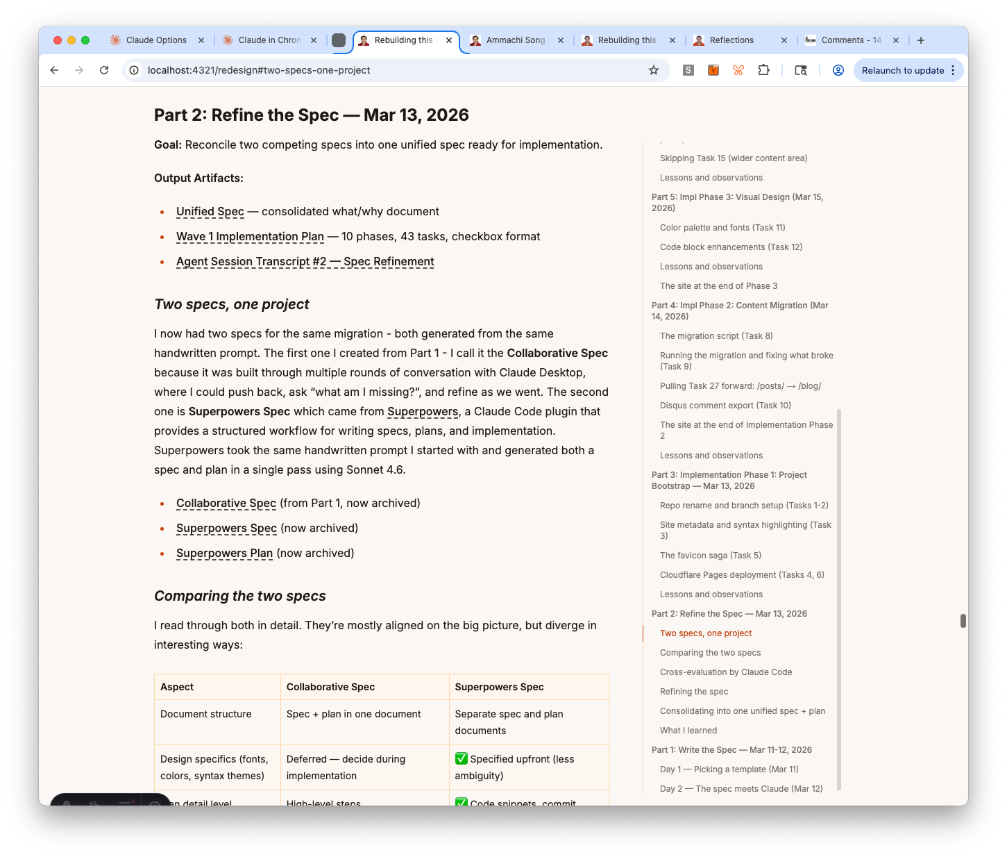
Two specs, one project
I now had two specs for the same migration - both generated from the same handwritten prompt. The first one I created from Part 1 - I call it the Collaborative Spec because it was built through multiple rounds of conversation with Claude Desktop, where I could push back, ask “what am I missing?”, and refine as we went. The second one is Superpowers Spec which came from Superpowers, a Claude Code plugin that provides a structured workflow for writing specs, plans, and implementation. Superpowers took the same handwritten prompt I started with and generated both a spec and plan in a single pass using Sonnet 4.6.
- Collaborative Spec (from Part 1, now archived)
- Superpowers Spec (now archived)
- Superpowers Plan (now archived)
Comparing the two specs
I read through both in detail. They’re mostly aligned on the big picture, but diverge in interesting ways:
| Aspect | Collaborative Spec | Superpowers Spec |
|---|---|---|
| Document structure | Spec + plan in one document | Separate spec and plan documents |
| Design specifics (fonts, colors, syntax themes) | Deferred — decide during implementation | ✅ Specified upfront (less ambiguity) |
| Plan detail level | High-level steps | ✅ Code snippets, commit messages, bash scripts (more actionable) |
| Astro version | ✅ Start on Astro 5, upgrade to 6 before launch (safe since v6 is brand new) | Astro 6 directly |
| Repo strategy | ✅ Branch-based coexistence (old site stays live) (lower risk) | In-place migration |
| Testing approach | Added tests during review rounds | ✅ Test-first (write failing test, then implement) (more disciplined) |
| Gap coverage (MathJax, RSS, Counterscale, etc.) | ✅ Discovered through conversation (conversation surfaces gaps) | Missing |
| Process | ✅ Multi-round back-and-forth (room for exploration) | One-shot generation |
| Code generation | Requires a bigger model to fill in the details | ✅ Can be implemented using a smaller model like Haiku (faster, cheaper) |
The pattern is clear: Superpowers is better at detail and structure, the Collaborative Spec is better at coverage and risk management. The one-shot approach produces a more actionable plan, but misses things you’d only catch through discussion — like MathJax in two posts, RSS feed continuity, or the fact that the site uses Counterscale instead of Google Analytics.
I think there’s real value in keeping things open-ended early on so there’s room for exploration and discovery, instead of narrowing to a specific path before you’ve asked enough questions.
Cross-evaluation by Claude Code
Instead of routing the specs through multiple agents, I gave both to Claude Code and asked it to evaluate them: overall assessment, pros and cons, what’s missing, and what could go wrong. I also asked it to flag any clarifying questions.
The analysis was thorough. Key findings:
- Collaborative Spec strengths: decisions with rationale, full lifecycle coverage, edge cases (Disqus export, RSS continuity, KaTeX, shortcode conversion), coexistence strategy, comprehensive testing plan
- Superpowers Spec strengths: clean spec/plan separation, TDD workflow, checkbox-style task tracking, specific color hex values, About page frontmatter schema
- What both were missing: rollback plan, performance baseline, SEO validation, content freeze protocol, explicit build time / CI budget
The biggest risks Claude flagged: the URL change from /post/ to /blog/ (redirect risk, ranking impact), Disqus thread URL → slug mapping (non-trivial), and the in-place migration in the Superpowers plan (no branch safety net).
Claude’s recommendation: use the Collaborative Spec as source of truth, borrow TDD and checkbox-style tasks from Superpowers.
Claude also asked four clarifying questions. My answers:
- URLs: change to
/blog/<slug>/(cleaner, redirects acceptable) - Analytics: Counterscale (not Google Analytics — Superpowers got this wrong)
- Disqus comments: migrate in Wave 1 as static HTML
- Output: analysis is enough, no need for a combined spec yet
Refining the spec
Before the comparison, I had run a separate pass with Claude Code asking 6 clarifying questions about the Collaborative Spec itself. Those answers shaped the spec further:
- Continuous deployment: deploy to Cloudflare Pages at end of Phase 1, then at every milestone — not one big deploy at the end
- Page format: all standalone pages (
/ammachi,/epsilla,/redesign) should be.mdfiles insrc/pages/, not.astro— simpler and consistent - Content Collections scope: blog only. Standalone pages are one-off, different-structure pages — making them a collection is over-engineering
- Directory: use
src/content/(conventional, matches AstroPaper and Astro docs) notsrc/data/ - Migration lists: explicit “Pages to migrate” and “Pages NOT migrated” lists, including
/image-testwhich wasn’t mentioned anywhere
Consolidating into one unified spec + plan
With the comparison done and my answers in hand, I asked Claude Code to create a consolidated spec — using the Collaborative Spec as the base, pulling the best elements from Superpowers, and separating spec from plan into two distinct documents:
- spec.md — the what/why document: decisions, visual design, content migration rules, URL routing, feature descriptions, testing strategy, Wave 2 roadmap. No step-by-step commands.
- wave-1-plan.md — the how/when document: 10 phases, 43 tasks, checkbox format, with TDD workflow and explicit “Expected:” outcomes per task.
The spec pulls the color palette (hex values for both modes), About page sectioned layout, and layout dimensions from Superpowers. Everything else comes from the Collaborative Spec — including Counterscale analytics, Disqus export, KaTeX, custom routes, Pagefind, and the full testing checklist.
Finally, I archived the now-superseded files (collaborative-spec.md, superpowers-spec.md, superpowers-plan-phase1.md) into docs/redesign/archive/ with a README that tells any future agent not to use them.
What I learned
The cross-evaluation surfaced something worth naming: one-shot generation is optimized for structure, not coverage. The Superpowers spec was more actionable and better formatted — but it missed Counterscale, shortcode conversion, Disqus comments, RSS continuity, custom routes, and search. These aren’t obscure edge cases; they’re load-bearing parts of the current site. A single-pass agent doesn’t know what it doesn’t know.
The comparison also clarified what “spec” and “plan” should each do. A spec is a record of decisions and rationale — useful six months later when you’re asking why did we do it this way? A plan is a checklist you execute against. Mixing them, as the Collaborative Spec did, makes both harder to use.
Part 1: Write the Spec — Mar 11-12, 2026
Goal: Go from “I want to redesign my blog” to a spec that an AI agent can execute against.
Output Artifacts
- The Spec (original collaborative spec, now archived — see Part 2 for the consolidated version)
- Agent Session Transcript #1 — Spec Creation
Day 1 — Picking a template (Mar 11)
I started by browsing Astro themes on astro.build/themes and Vercel’s Astro templates. I looked at a bunch of them, evaluating for clean design, readability, and that hard-to-name quality of feeling right.
The one I kept coming back to was AstroPaper — clean layout, good typography, nice page transition animations, and not over-designed. It felt like a solid foundation I could build on rather than fight against.
Then I did something deliberately low-tech: I wrote the spec by hand, in a notebook. No AI, no editor. Just thinking through what I actually want from the new site.
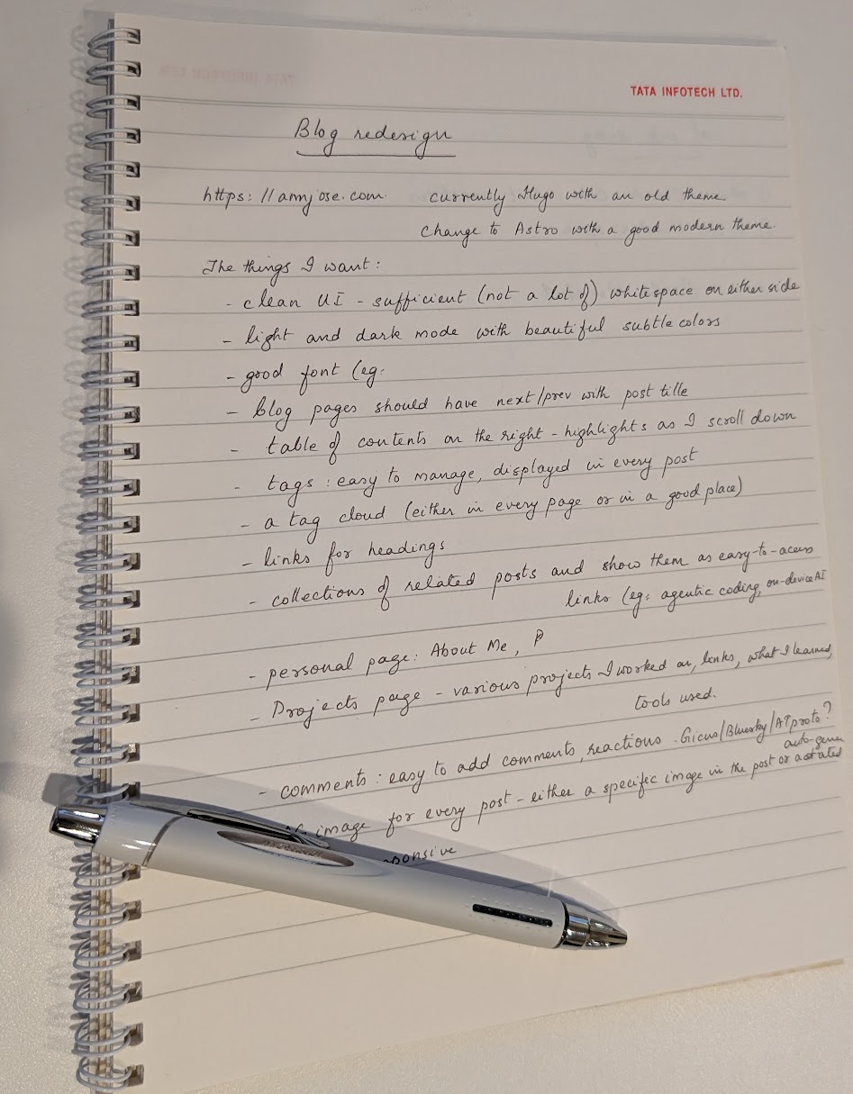
Digitized version of the handwritten spec (click to view)
Blog redesign — https://annjose.com, currently Hugo with an old theme. Change to Astro with a good modern theme.
The things I want:
- Clean UI - sufficient (not a lot of) whitespace on either side
- Light and dark mode with beautiful subtle colors
- Good font
- Blog pages should have next/prev with post title
- Table of contents on the right - highlights as I scroll down
- Tags: easy to manage, displayed in every post
- A tag cloud (either in every page or in a good place)
- Links for headings
- Collections of related posts and show them as easy-to-access links (eg: agentic coding, on-device AI)
- Personal page: About Me
- Projects page - various projects I worked on, links, what I learned, tools used
- Comments: easy to add comments, reactions. Giscus/Bluesky/ATproto? Auto-generated?
- Image for every post - either a specific image in the post or auto-generated
- Mobile responsive
Day 2 — The spec meets Claude (Mar 12)
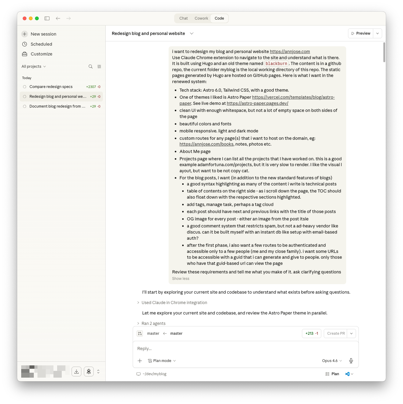
I opened Claude Desktop, modified the handwritten prompt to add a few details on tech stack and gave it as follows:
Redesign my blog and personal website https://annjose.com. Use Claude Chrome extension to navigate to the site and understand what is there. It is built using Hugo and an old theme named blackburn. The content is in a github repo, the current folder myblog is the local working directory of this repo. The static pages generated by Hugo are hosted on GitHub pages. Here is what I want in the renewed system:
- Tech stack: Astro 6.0, Tailwind CSS, with a good theme.
- One of themes I liked is Astro Paper https://vercel.com/templates/blog/astro-paper. See live demo at https://astro-paper.pages.dev/
- clean UI with enough whitespace, but not a lot of empty space on both sides of the page
- beautiful colors and fonts
- mobile responsive. light and dark mode
- custom routes for any page(s) that i want to host on the domain, eg: https://annjose.com/books, notes, photos etc.
- About Me page
- Projects page where I can list all the projects that I have worked on. this is a good example adamfortuna.com/projects, but it is very slow to render. I like the visual layout, but want to be not copy cat.
- For the blog posts, I want (in addition to the new standard features of blogs):
- a good syntax highlighting as many of the content i write is technical posts
- table of contents on the right side - as i scroll down the page, the TOC should also float down with the respective sections highlighted.
- add tags, manage task, perhaps a tag cloud
- each post should have next and previous links with the title of those posts
- OG image for every post - either an image from the post itself
- a good comment system that restricts spam, but not a ad-heavy vendor like discus. can it be built myself with an instant db like setup with email-based auth?
- after the first phase, i also want a few routes to be authenticated and accessible only to a few people (me and my close family). i want some URLs to be accessible with a guid that i can generate and give to people. only those who have that guid-based url can view the page
Review these requirements and tell me what you make of it. ask clarifying questions
Claude did something I didn’t expect — before asking anything, it explored the entire codebase and live site on its own. It spawned two agents in parallel: one crawled the repo structure, the other fetched annjose.com and the AstroPaper demo. Only after building its own understanding did it come back with questions.
It asked two rounds of clarifying questions — here are the key decisions that came out of that exchange:
| Decision | What I chose |
|---|---|
| Fork Astro Paper or build from scratch? | Fork and customize |
| Hosting platform | Cloudflare Pages |
| Existing Disqus comments | Static HTML embed (export old, Giscus for new) |
| Migrate all 58 posts? | Yes, all of them |
| Private routes / auth | Defer to Phase 2 |
| Projects page format | Side projects & open source, card grid layout |
The result: an 8-phase migration plan spanning ~14 days. The critical path is a content migration script that converts all 58 posts from Hugo format (TOML front matter, Hugo shortcodes) to Astro format (YAML front matter, MDX). Everything else builds on that.
See the first version of the spec.
Reviewing and refining the spec
The initial spec was solid but needed pressure-testing. I reviewed it and came back with 7 questions covering scope, naming, URLs, deployment strategy, Astro 6 compatibility, and gaps. This kicked off two more rounds of back-and-forth that significantly shaped the final spec.
Key refinements from the review:
- Scope split: Moved the Projects page and Auth to “Wave 2” (post-launch enhancements), keeping Wave 1 focused on the core site, blog migration, and deployment. Also renamed “Phase 2” (which was overloaded — used for both implementation phases and deferred features) to “Wave 1” vs “Wave 2” to avoid ambiguity.
- URL migration strategy: New posts live at
/blog/<slug>/instead of Hugo’s/post/<slug>/. Old URLs preserved via Cloudflare_redirectswith 301 redirects — no broken links. - Coexistence plan: The old Hugo site stays live at annjose.com while the new Astro site is tested at
annjose.pages.dev. DNS cutover happens only when the new site is fully validated. - Astro version: AstroPaper hasn’t been updated for Astro 6 yet, so we start on Astro 5 and upgrade before launch (Phase 7 in the plan).
- Repo strategy: I almost let the agent create a new repo, but caught it — that would lose all git history. Instead, we’re using an
astrobranch in the same repo, with a repo rename (myblog→annjose.com) and branch rename (master→main) at cutover.
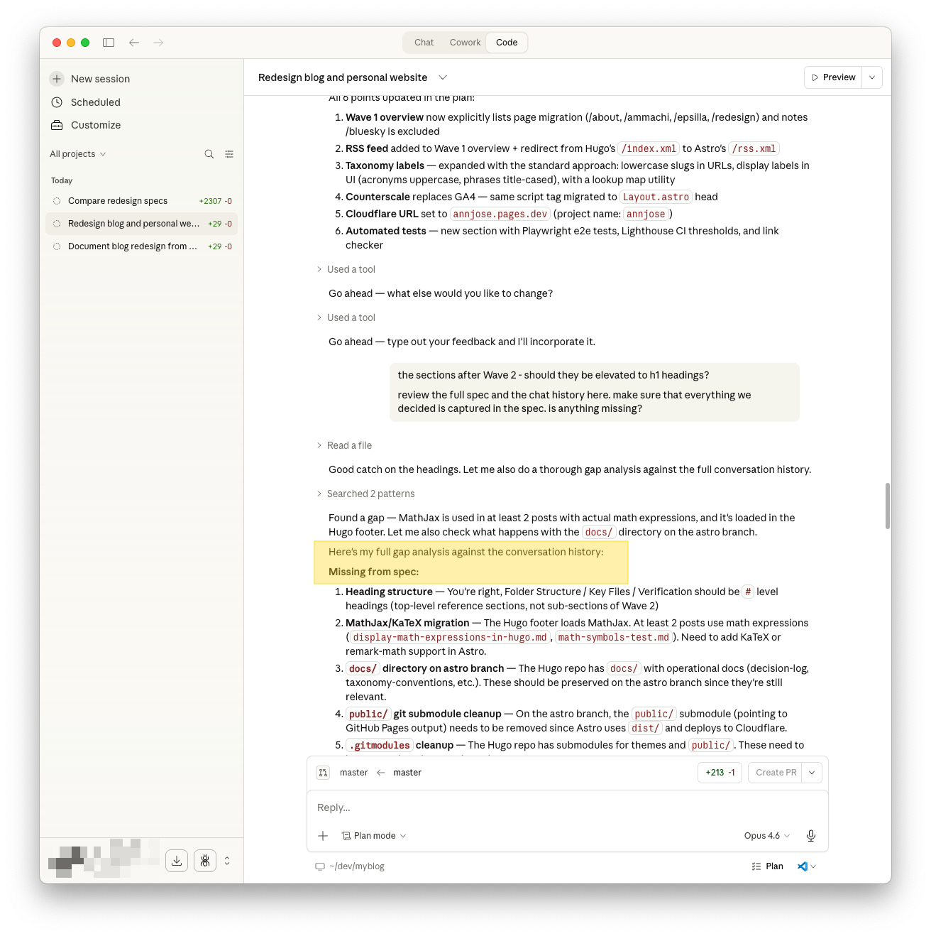
The agent also ran a gap analysis and found several things neither of us had mentioned:
- MathJax → KaTeX migration (2 posts use math expressions)
- Git submodule cleanup (
public/and theme submodules need removal on the astro branch) - Missing from Wave 1 overview: RSS feed, page migration (/about, /ammachi, /epsilla, /redesign)
- Analytics: The spec mentioned Google Analytics, but the site actually uses Counterscale (self-hosted on Cloudflare Workers). Fixed throughout.
- Automated tests: Added Playwright e2e tests, Lighthouse CI, and a link checker — none of which were in the original spec.
The final spec has 10 decisions, 8 implementation phases across ~14 days, a full folder structure reference, and a verification checklist. See the full diff of the spec refinements and the final version of the spec.
What I learned
Don’t start with the AI. Start with your own thinking — even on paper. The handwritten spec forced me to decide what I actually want before an agent started suggesting things. The AI’s job was to pressure-test it and add structure, not to dream it up from scratch. Also: the agent’s first move was to explore, not ask. It built context before engaging. That’s a good pattern for humans too.
The review rounds taught me something else: read the spec like a skeptic, not an approver. The agent produced a thorough plan, but it had a “new repo” default that would have lost git history, wrong analytics (GA instead of Counterscale), and naming collisions I only caught by reading carefully. The AI is good at structure and completeness; the human is good at catching things that feel wrong.